
Responsive Web Design Basics: The 3 Things Every Website Needs
Understanding the basics of responsive web design is essential for any business owner, marketer, or developer who wants a website that works well on every device. The responsive web design basics — fluid grids, flexible media, and CSS media queries — form the technical foundation that allows a single website to serve users perfectly whether they’re on a desktop, tablet, or smartphone. Greauxx builds every website with these fundamentals at its core.
Responsive Web Design Basic #1: Fluid Grid Layouts
The first responsive web design basic is using fluid grid layouts instead of fixed pixel widths. A fluid grid uses percentage-based widths so that page elements resize proportionally as the viewport changes. For example, instead of a column being 600px wide (which looks fine on desktop but overflows on mobile), a fluid grid might set it at 50% — meaning it always takes up half the available space regardless of screen size. This is the foundation of the responsive web design basics.
Responsive Web Design Basic #2: Flexible Images and Media
The second responsive web design basic is ensuring all images, videos, and embedded media scale correctly within their containers. The classic CSS rule max-width: 100% ensures images never overflow their containers while still displaying at their natural size when space allows. Modern responsive web design basics also include using the srcset attribute to serve appropriately sized images based on the device’s screen resolution — improving performance on mobile connections.
Responsive Web Design Basic #3: CSS Media Queries
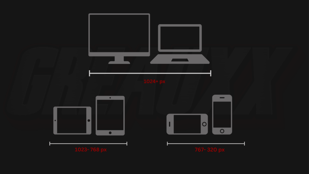
The third responsive web design basic is CSS media queries, which allow designers to apply different styles at different viewport widths. Media queries define breakpoints — specific screen widths where the layout adjusts to better suit the available space. At a breakpoint of 768px, for example, a three-column desktop layout might collapse into a single-column mobile layout. These responsive web design basics — combined — create websites that look intentional and polished at every screen size.
Why These Responsive Web Design Basics Matter for Your Business
Google uses mobile-first indexing — meaning it judges your website based on its mobile version when determining search rankings. A site that doesn’t follow responsive web design basics will rank poorly, regardless of its desktop appearance. Additionally, with over 60% of web traffic coming from mobile devices, a non-responsive site delivers a poor experience to the majority of your visitors — directly hurting conversion rates.
Build a Properly Responsive Website with Greauxx
Greauxx applies responsive web design basics and advanced optimization techniques to every website we build for clients in Lafayette, LA, Miami, FL, and across the country. Contact Greauxx today to discuss your website project. Explore our web design services or read the original A List Apart article that defined responsive web design.
Why Responsive Web Design Basics Matter for SEO
The responsive web design basics directly impact your Google rankings. Core Web Vitals — Google’s official performance metrics — are heavily influenced by how well your website implements responsive web design basics like proper image sizing, efficient CSS, and optimized font loading. Sites that follow responsive web design basics correctly have lower bounce rates, longer session times, and higher conversion rates. Greauxx applies these responsive web design basics to every project to help our clients rank higher and convert more visitors into customers consistently.
Understanding and implementing responsive web design basics is foundational for any business investing in digital marketing. Whether you’re building a new website or auditing an existing one, ensuring the three core responsive web design basics — fluid grids, flexible media, and CSS media queries — are properly implemented is your first step toward a website that performs optimally on every device your customers use to find and engage with your business.